Trireme is a quantitative digital asset firm specialising in high-frequency trading, cryptocurrency market making, and liquidity provision. Named after the ancient Greek warship — built for precision, speed, and dominance — Trireme supports token launches, manages digital asset treasuries, and provides institutional-grade liquidity to crypto projects worldwide. Since launch, they've supported over 200 projects and continue to grow steadily as a trusted name in the space.
Trireme launched with a basic placeholder website that did nothing to reflect the sophistication of the firm behind it. For a company operating at institutional level — where trust, precision, and credibility are everything — the gap between their product and their digital presence was a liability. They needed a brand and website worthy of the precision and ambition driving every trade they made.
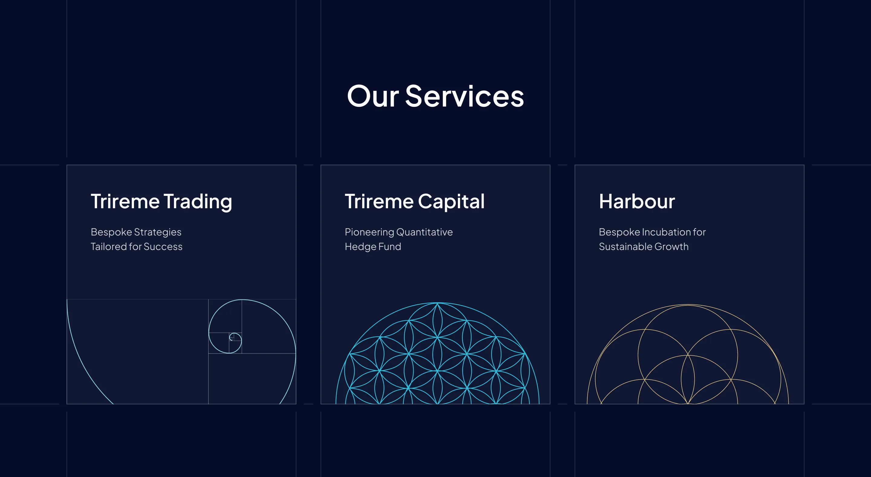
We started from scratch with a full brand identity, building everything around the Trireme concept: an ancient warship engineered with mathematical perfection. We drew on sacred geometry — the Fibonacci sequence, the Flower of Life, the Seed of Life — and fused it with a deep-sea colour palette that echoed the Greek maritime origins of the name. The result was a visual language where mythology met mathematics.
From that foundation, we designed and built a complete Webflow website, bringing the identity to life through intricate geometric animations that move the way the firm thinks — with precision and intention. Every detail was built to signal: this is not an ordinary fund.
Trireme now has a brand and digital presence that matches the ambition and rigour of their operation. The website has been running since launch, actively supporting their marketing and business development as the firm continues to grow. In a crowded, trust-sensitive industry, they stand apart — visually and conceptually.